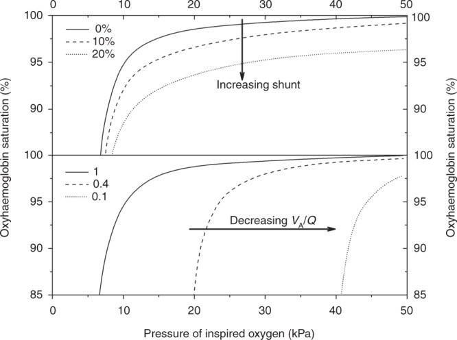
Fig. 1. The oxyhaemoglobin dissociation curve: proportion of haemoglobin saturation versus pressure of inspired oxygen.

Increasing shunt (upper diagram) displaces the curve downwards and decreasing VA/Q (lower diagram) shifts the curve to the right. The dashed line in the upper diagram represents a subject with a shunt of 10% and the dotted line a subject with a shunt of 20%. The dashed line in the lower diagram represents a subject with a VA/Q of 0.4 and the dotted line a subject with a VA/Q of 0.1. Reproduced from Dassios et al.11
