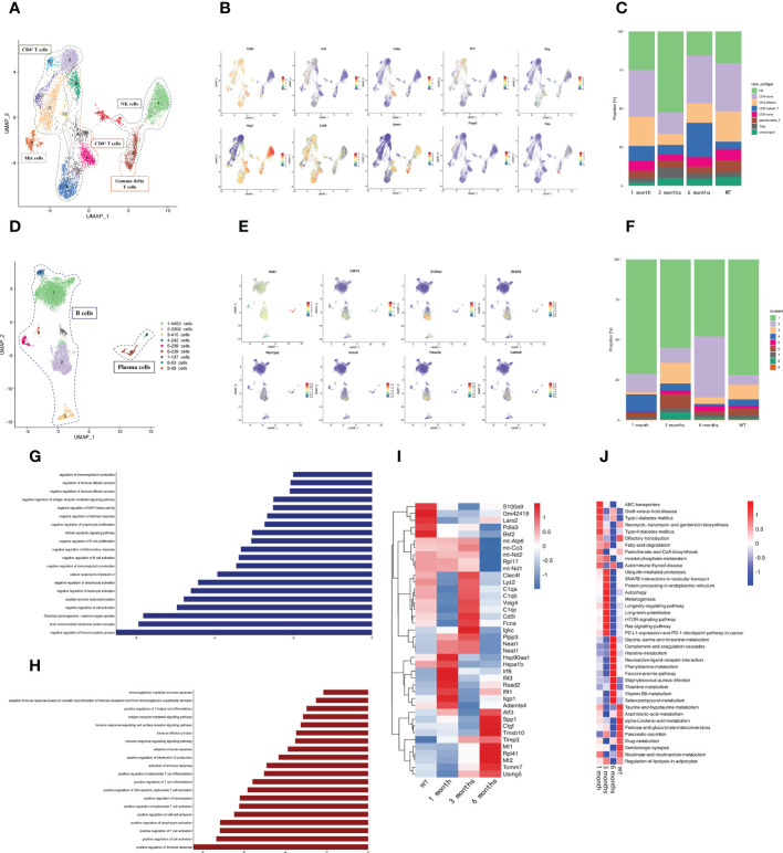
Figure 2.
A distinct microenvironment in mouse liver after E. granulosus infection. (A) The UMAP plot displays 13 NK/T cell subclusters; (B) The expression levels of specific markers for each NK/T cell type are plotted onto a UMAP map; (C) The histogram depicts the proportions of NK/T cell subclusters in each infection period; (D) The UMAP plot shows the 9 B cell subclusters; (E) The expression levels of specific markers for each B cell type are plotted onto the UMAP map; (F) The histogram shows the proportions of B cell subclusters in each infection period; (G) The bar map shows the enrichment pathways of the Top 200 genes in B2 cells; (H) The bar map depicts the enrichment pathways of the Top 200 genes in B4 cells; (I) The heat map shows the endothelial cells’ highly differentially expressed genes identified during each infection period. Dark blue indicates lower expression; dark red indicates higher expression; (J) The heat map shows the difference in pathway activities scored by GSVA per endothelial cell between each infection period.

