Figure 7.
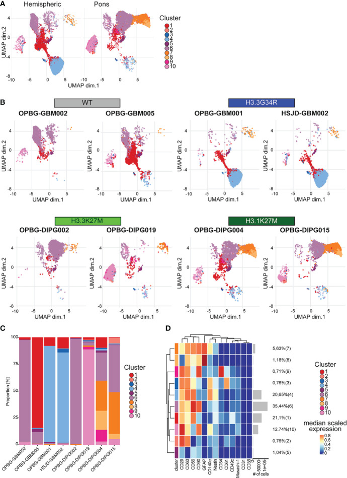
UMAP analysis. (A) UMAP plots of the hemispheric and pons cell lines colored according to the identified clusters. (B) UMAP plots for each of the analyzed cell lines, colored according to the identified cluster. (C) Bar plots representing the abundance of each of the clusters identified in each cell lines. (D) Heatmap summarizing the antigenic profile of each of the identified cluster.

