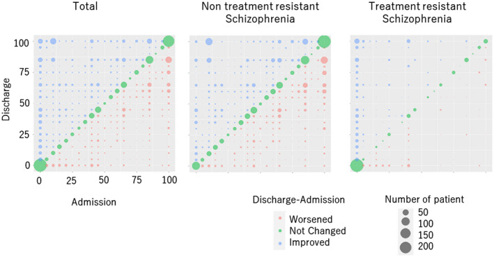
FIGURE 1.

Correlation between individual fitness score at admission and discharge. The individual fitness score at admission was plotted on the x‐axis, and the individual fitness score at discharge was plotted on the y‐axis, with the number of cases indicated by the size of the circle.
