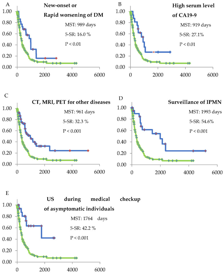
Figure 4.
Kaplan–Meier curves of the symptomatic group and each of the asymptomatic groups. The green line shows the Kaplan–Meier curve of the symptomatic group. Statistical analysis for survival was performed in each group compared with the symptomatic group. The median survival time (MST), 5-year survival rate (5-SR), and the p-value are shown in each Figures ((A): group 3, (B): group 4, (C): group 5, (D): group 6, and (E): group 7). All of the asymptomatic groups showed a significantly longer MST compared with that shown in the symptomatic group. The horizontal axis shows survival days.

