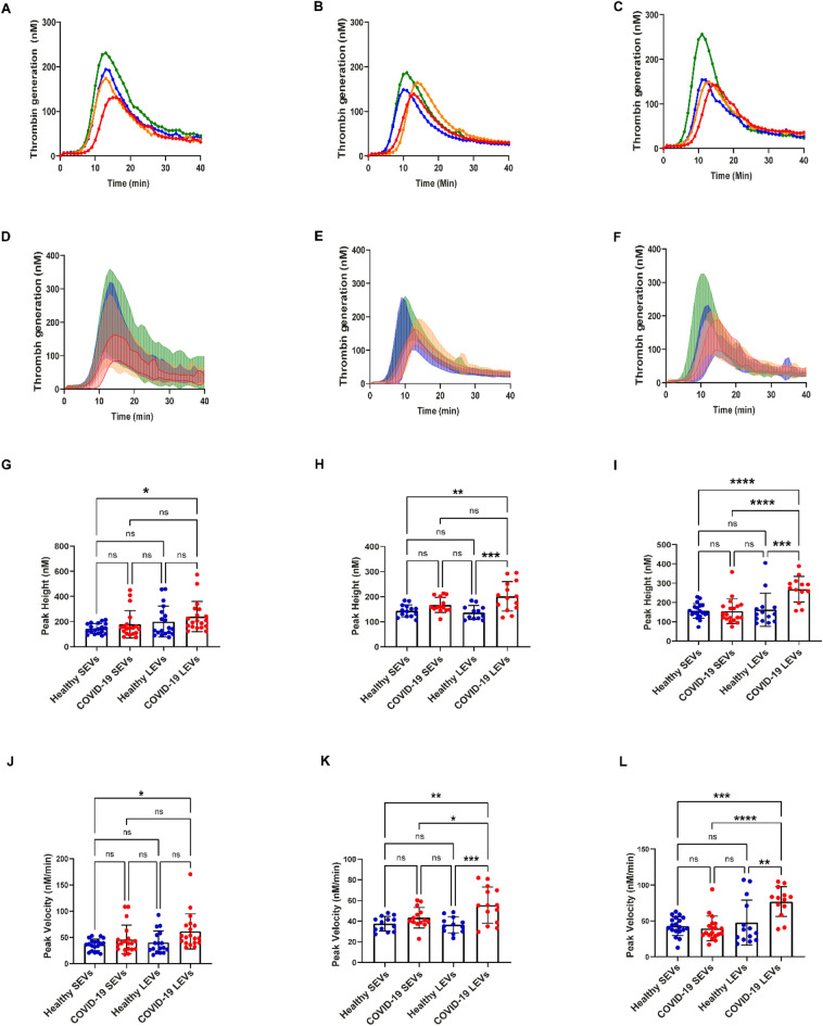
Figure 3.
Thrombin generation induced by healthy and COVID-19 EVs: (A–C)—mean TG curves for different concentrations of SEVs and LEVs: 50 µg/mL (A), 100 µg/mL (B), 200 µg/mL (C). (D–F) Mean thrombin concentrations ± SD over time for (50 µg/mL) (D), 100 µg/mL (E) and 200 µg/mL (F). The lower line for each group represents mean—SD between all the samples in the group, and the upper one represents mean + SD. (G–I) Peak height values of healthy donor and COVID-19 (+) patients SEVs and LEVs. (J–L) Peak velocity values of healthy donor and COVID-19 (+) patients SEVs and LEVs at 50 µg/mL (G,J), 100 µg/mL (H,K), 200 µg/mL (I,L). 50 µg/mL: healthy donor SEVs (n = 19) LEVs (n = 17), COVID-19 (+) patients SEVs (n = 19) and LEVs (n = 19). 100 µg/mL: healthy donor SEVs (n = 13) LEVs (n = 14), COVID-19 (+) patients SEVs (n = 12) and LEVs (n = 14). 200 µg/mL: healthy donor SEVs (n = 19) LEVs (n = 19), COVID-19 (+) patients SEVs (n = 15) and LEVs (n = 13), EDP (n = 7). Datapoints indicate individual measurements, and p-values are from the one-way ANOVA analysis for comparison between groups. Ns, p > 0.05; *p ≤ 0.05; **p ≤ 0.01; ***p ≤ 0.001; ****p ≤ 0.0001.

