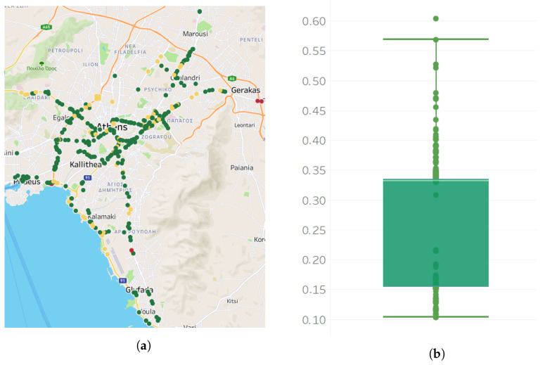
Figure 3.
Map of sensors and boxplot for the missing values per sensor. (a) View of the 420 sensors on a map. Each point on the map represents a sensor. Red color marks represent sensors with higher percentages of missing values, green marks sensors with low percentages of missing values. (b) Percent of missing values per sensor in a boxplot showing the lower (Q1) and upper (Q3) quartile, the median and mean values. Data falling outside the lower (Q1)–upper (Q3) quartile range are plotted as outliers of the data.

