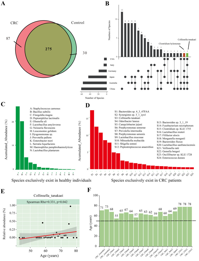
Fig. 3.
A Venn diagrams illustrating the number of species in CRC patients (pink) and healthy controls (light green). B UpSet plot of differentially distributed taxa. The left graph represents the total number of differently distributed species (X-axis) in different countries (Y-axis). The right graph represents the intersection of sets of species in multiple countries. Each column corresponds to a country or set of countries (dots connected by lines below the X-axis) containing the same species. The number of species in each set appears above the column, while countries shared are indicated in the graphic below the column. C Histograms of species exclusively present in healthy individuals. The X-axis represents species that are exclusively shared in healthy individuals (with an accumulated relative abundance of more than 0.5% of each sample in healthy groups). The Y-axis represents a percentage of accumulated relative abundance, which is a measure of the proportions of the microbiota composed of the organism in the healthy control group. D Histograms of species exclusively present in CRC individuals. The X-axis represents species that are exclusively shared in the CRC groups with an accumulated relative abundance of more than 0.5% of each sample in the CRC groups. The Y-axis represents the percentage of relative abundance in the CRC and control groups. E Scatter plots of C. tanakaei and age. The Spearman rank correlation test, p-value < 0.05 was considered statistically significant). F The age distributions of individuals with expression of C. tanakaei in the feceal samples

