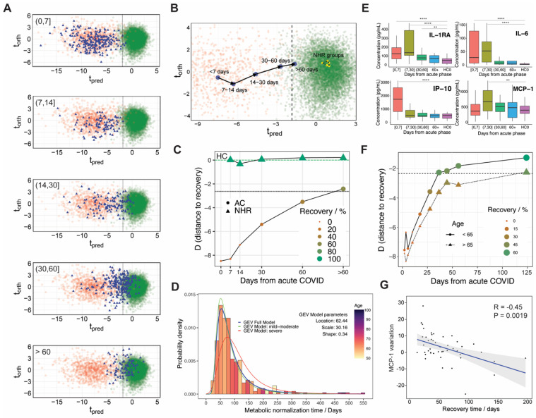
Figure 3.
(A) Projection of the recovery samples (blue triangles, RE0 and RE1 cohorts) in the O-PLS-DA model that discriminates between COVID-19 patients (red circles, AC0 and AC1 cohorts) and healthy individuals (green circles, HC cohort), as a function of the recovery time for the sample, as indicated in the plots. (B) Projection of the recovery trajectory on the O-PLS-DA model of COVID-19 discrimination for hospitalized patients (blue circles) and non-hospitalized recovered (NHR) (yellow circles). (C) distance to recovery (D) as a function of the days from the infection onset for hospitalized patients (circles) and NHR individuals (triangles). The color and the size of the circles or triangles is proportional to the fraction of recovered people at a given time, as indicated in the legend. (D) Histogram of the individual recovery times for the metabolic phenotype assuming a linear recovery model. The distribution fits well to a GEV function (blue line), whose fitting parameters are enclosed. The green and red lines show the same type of model but using only a subset of patients according to the hospital’s severity criteria: mild-moderate (green) or severe (red). The color code for the histogram bars displays the average age, as indicated in the legend. (E) Boxplots showing the time evolution of serum concentration corresponding to the four cytokines/chemokines that were found significantly upregulated in hospitalized patients. Statistical significance of the difference between the two groups was estimated by the p-value: 0.01 (**) and 0.0001 (****). (F) distance to recovery (D) as a function of the days from the infection onset for hospitalized patients as a function of age: people above/below 65 years old are represented by circles/triangles. The color and the size of the circles or triangles are proportional to the fraction of recovered people at a given time, as indicated in the legend. (G) Correlation between the variation of MCP-1 over time (assuming a linear decay from day 8) and the individual recovery time (assuming linear recovery). The blue line corresponds to the best linear fit, with the confidence levels depicted in gray.

