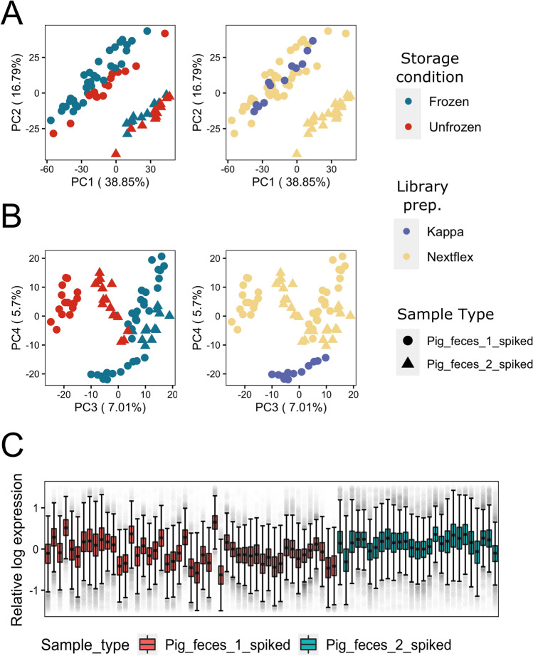
Figure 2.
Visualizations of the CLR-normalized data of all spiked samples: (A) Principal component analysis (PCA) plots showing sample clustering based on sample origin (pig1 vs pig 2) explained by PC1 and PC2, while (B) separation of samples based on storage conditions and library preparation kits used were explained by PC3 and PC4, respectively. (C) Relative log expression (RLE) plot of all spiked samples, showing considerable variations based on deviation of the medians between samples of the same source, as well as dissimilarity of interquartile ranges (IQR).

