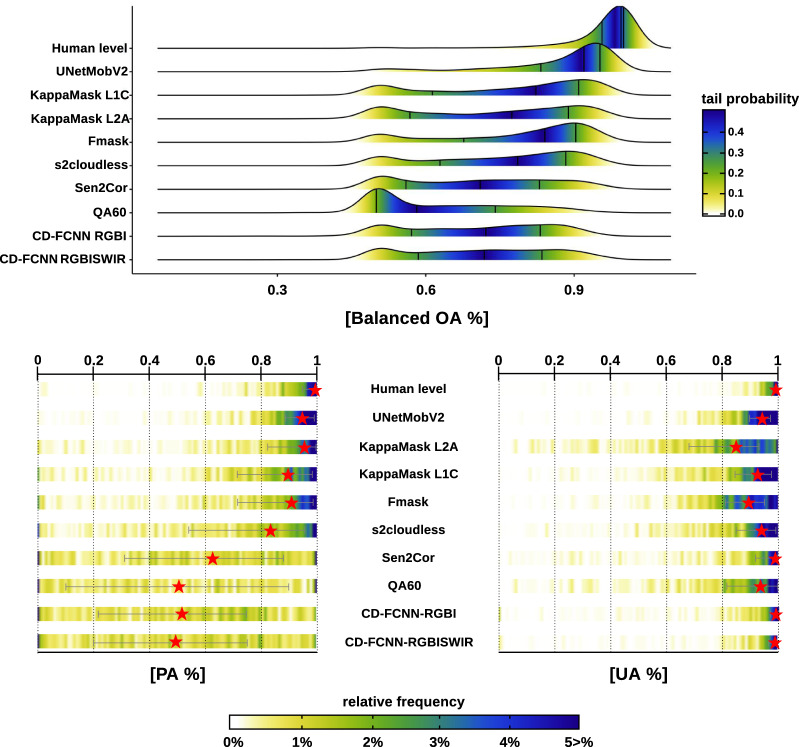
Fig. 9.
BOA, PA, and UA comparison for the CloudSEN12 dataset. The upper figure depicts BOA density estimations for all CloudSEN12 IPs high-quality. The colors reflect the tail probability estimated by 0.5-abs(0.5-ecdf), where ecdf is the empirical cumulative distribution function. The vertical black lines drawn represent the first, second, and third quartiles, respectively. The heatlines in the lower figure shows the PA and UA value distribution. The red stars shows the median and the gray lines the 25th and 75th percentiles.

