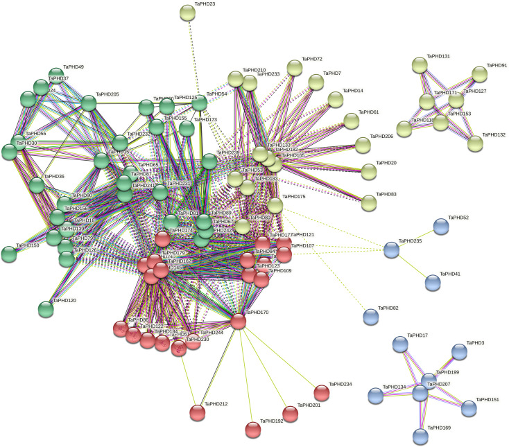
Figure 7.
Predicted protein association networks analyses of TaPHD proteins. The four colors represent different interaction areas. The nodes represent the proteins, and the lines represent the protein-protein associations. Light blue and purple lines represent the known interactions from the curated database or experimentally determined interactions; green, red, and blue lines represent gene neighborhood, gene fusions, and gene co-occurrence, indicating that the proteins have the predicted interactions; yellow, black, and light blue lines represent textmining, co-expression, and protein homology, respectively.

