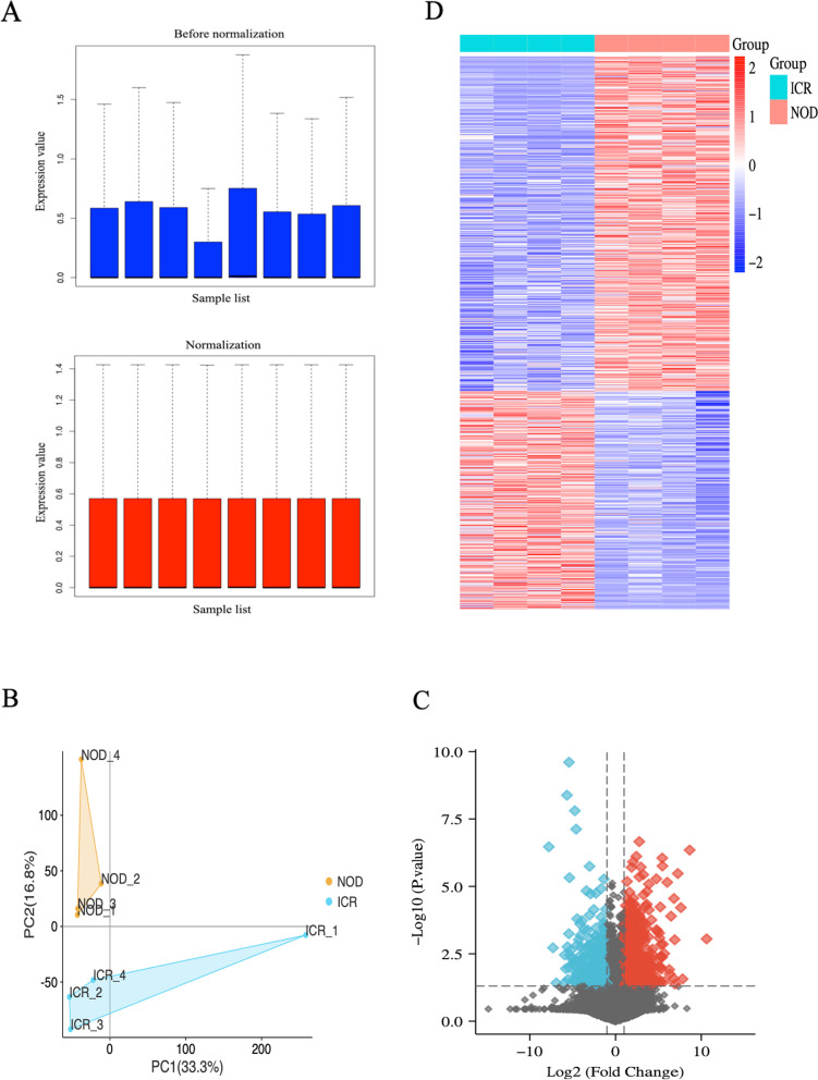
Fig. 2.
Processing of transcriptome sequencing. A Normalization of the transcriptome sequencing data. The black line in each box represents each data group’s median, which determines the degree of normalization of the data through its distribution. The upside is the expression value data before normalization, and the normalized expression value data is the downside. B PCA diagram of samples based on expression abundance. C The volcano of DEGs. The blue points indicate the screened down-regulated DEGs, the red points indicate the screened up-regulated DEGs, and the black points indicate genes with no significant differences. D The heatmap for all DEGs. All DEGs are screened based on P-value < 0.05 and |fold change| > 1. DEGs differentially expressed genes; PCA, Principal Component Analysis

