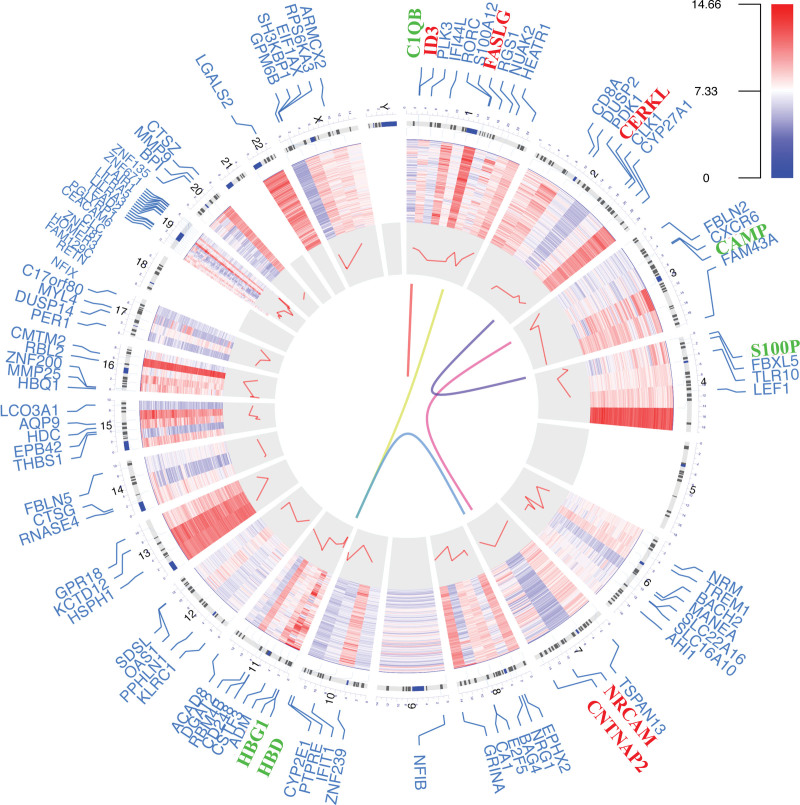
Figure 2.
Circos plot of expression patterns and chromosomal positions of top 100 differentially expressed genes. The outer circle represented chromosomes, and lines coming from each gene point to their specific chromosomal locations. The multiple sclerosis microarray dataset from GSE136411 was represented in the inner circular heatmap. The red lines in the inner layer indicated -log10 (adjusted P value) of each gene. According to |log2 fold change|, the top five up-regulated genes (red) and the top five down-regulated genes (green) were connected with lines in the center of the Circos plot.

