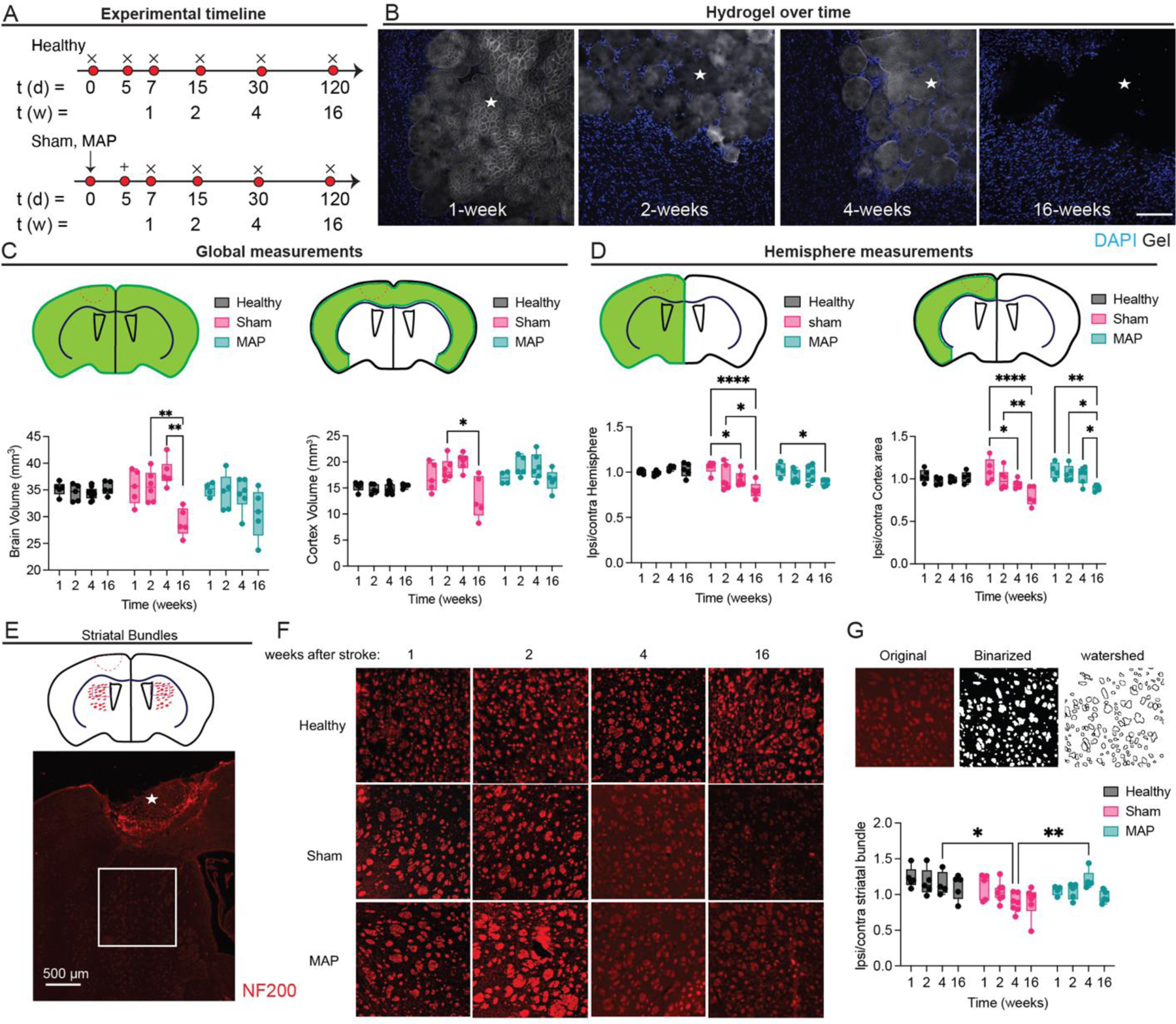
Figure 2.

A. Schematic of experimental timeline where arrow signifies stroke day, + signifies injection day (MAP only), and x signifies sacrifice and analysis time point. Sham is stroke only with no injection. B. Hydrogel imaging over time after stroke (1-, 2-, 4-, 16 weeks post stroke). Scale bar = 100 µm. C. Global measurements of brain and cortex volume for healthy, sham and MAP treated groups. D. Ratios of hemisphere and cortex area comparing ipsilateral to contralateral regions for healthy (no injury), sham (stroke only) and MAP (stroke + MAP) treated groups. E. Schematic of NF200 axonal bundles in hemispheres ipsilateral and contralateral to the lesion, showing ROI presented in F. F. NF200 axonal bundles over time for healthy, sham and MAP. G. shows ipsilateral to contralateral ratios of NF200 axonal bundles number for healthy, sham and MAP treated groups. All measurements were done on FIJI. Statistical analysis was done in GraphPad Prism using two-way ANOVA analysis of variance followed by a multiple comparisons test comparing each condition across time or between condition at each timepoint. The dots in each plot indicate the number of animals (n = 5 biological replicates) that were analyzed per-group and were considered independent experiments. *, **, ***, **** means p < 0.05, 0.01, 0.001, 0.0001. ☆ represents the stroke cavity.
