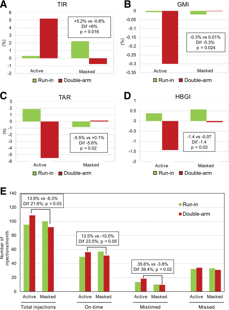
Figure 1.
Effect of Insulclock on glycemic control and treatment adherence. A–D: Graphs show the mean change from baseline to randomization (green) and from randomization to final double-arm phase (red) in the final evaluable participants. E: Bar graphs show the number of insulin injections taken per month, including total injections, on-time injections, mistimed injections, and missed injections. Dif, differences between the active and masked groups in change during the double-arm phase.

