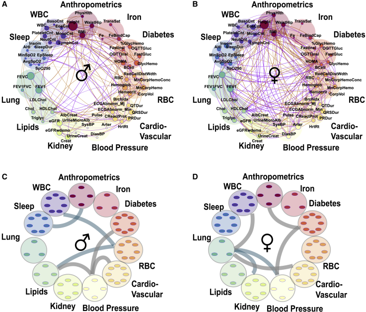
Figure 5.
Gender differences in genetic correlations and heritabilities
(A and B) Correlation plots where each phenotype is represented by a node and the correlations are represented by connections (edges) between nodes. The size of the node is proportional to the phenotype heritability. The thickness of the edge is proportional to the strength of correlation and the color represents magnitude: orange represents positive and purple negative correlation. Shown are fractional genetic correlations ( between the 61 phenotypes in the extended HCHS/SOL dataset (p < 0.05) in males (A) (n = 5,175) and females (B) (n = 7,390).
(C and D) Enriched (p < 0.05) correlations between the phenotypic domains. Teal represents genetic correlations and gray represents household correlation in males (C) and females (D).

