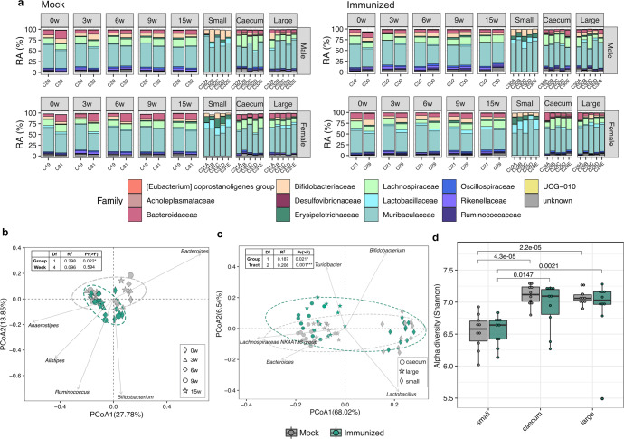
Fig. 2. Temporal dynamics in microbiome composition after vaccination.
a Stacked bar chart displaying the relative abundance of bacterial families (top 15 most abundant) at different timepoints in HTI-vaccinated (Immunized) or PBS-vaccinated (Mock) mice. CageID (pooled feces) and individual samples for each cage (intestinal content) are reported in the x-axis. PCoA biplot based on the first and second components (Bray–Curtis distances at genus level) of (b) fecal samples from cages (c) and from gut sections (small intestine, caecum and large intestine). Biplots report genera with the top 5 effects on the community composition, with vector position indicating the direction of the effect. Arbitrary ellipses were drawn to facilitate the interpretation of the figure. PERMANOVA r-squared and p-values are shown. d Alpha diversity based on Shannon entropy index (ASV level) of individual fecal samples obtained at the last point of the study from small intestine, caecum and large intestine. Boxplots are colored by the experimental group. Median values and interquartile ranges are shown in boxplots. p-values from Wilcoxon signed rank tests are reported.

