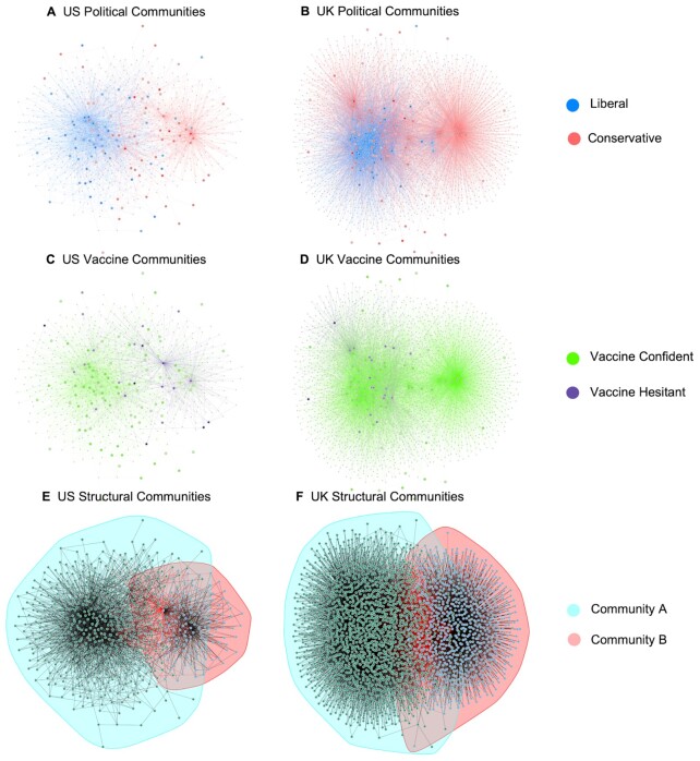
Fig. 1.
Visualizations of Twitter networks in the US (left) and UK (right). The first row shows the networks of those who are more liberal/left-wing (blue nodes) versus those who are more conservative/right-wing (red nodes) in the US (A) and UK (B). The second row shows the networks of vaccine confident individuals (green nodes) and vaccine hesitant individuals (purple nodes) in the US (C) and UK (D). In the third row, borders are drawn around structural communities identified by a label-propagation graph partitioning algorithm in the US (E) and UK (F). Each small uncolored node represents an influencer that at least three of the participants were following, and each large colored node represents a participant who is following an influencer. Each edge between two nodes represents a following relationship (one person following another Twitter account). Layouts of the graphs were created using the large-graph-layout algorithm to visually highlight community structures. Absolute distances between nodes are not meaningful in these visualizations.

