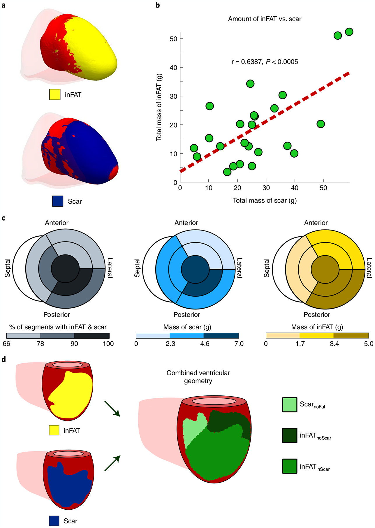
Fig. 2 |. Distributions of inFAT and scar.

a, Example of overlap between inFAT and scar distribution in a heart with an anterior infarct. b, Relationship between the total amount of scar and the total amount of inFAT across the patient cohort. Green dots represent data from individual patient hearts; in red is the line of best fit. c, Relationship between scar and inFAT distributions across different anatomical regions. The bullseye diagram shows a short-axis view (looking upward from below the heart). For each bullseye diagram, the outer and middle rings represent the three basal and middle segments, respectively (anterior/anterolateral, inferior/inferolateral and septal). The central segment represents the apex. The left panel shows the percentage of segments with both inFAT and scar; the middle and right panels show the mass of scar and inFAT across regions. d, Schematic of definitions for overlapping and non-overlapping regions between inFAT and scar. Three regions were defined: (1) inFAT and scar overlap (inFATinScar); (2) scar not overlapping with inFAT (ScarnoFat); and (3) inFAT not overlapping with scar (inFATnoScar).
