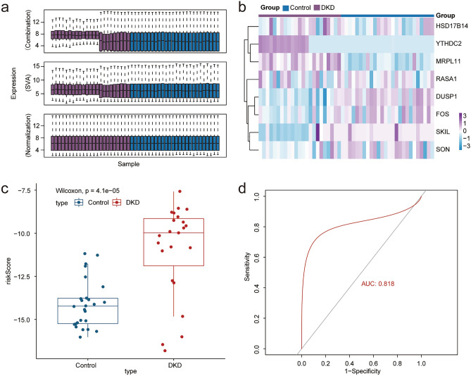
Figure 7.
Model validation. (a) Data sets GSE30566, GSE99339 and GSE30528 were combined, batch removed and normalized. (b) Heat map shows the difference in the expression of model genes between the two groups. In the legend, purple represents DKD sample and dark blue represents normal kidney tissue sample (Control). (c) Box plot shows that the risk score in DKD group is significantly higher than that in control group after calculating the risk score of the new data set sample according to the model (p < 0.05 was considered statistically significant). (d) ROC curve confirmed that the diagnostic model still had high accuracy (AUC = 0.818), confirming that the prediction effect of the model is stable and repeatable.

