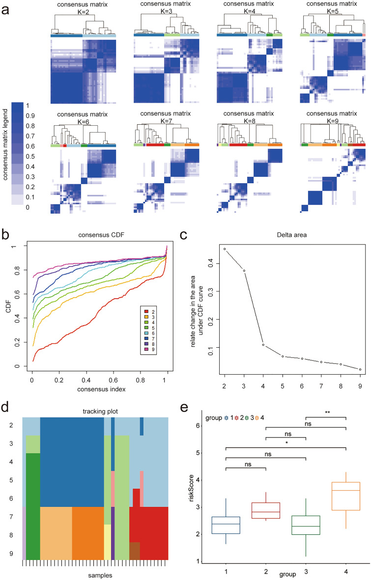
Figure 8.
Ferroptosis subtypes. (a) The best immune classification was analyzed by consistency clustering analysis, matrix heat map is showed according to K from 2 to 9. Both rows and columns of the matrix represent samples. The consistency matrix clustering value is showed from 0 (impossible clustering together) to 1 (always clustering together) with white to dark blue. The consistency matrix is arranged according to the consistency classification (the tree map above the heat map). The bar between the tree map and the heat map is the category. (b) Consistent cumulative Distribution Function (CDF) graph: This graph shows the cumulative distribution function with different values of K, and CDF reaches an approximate maximum value when K = 4. (c) Incremental area of variables: when K = 4, the area under the CDF curve tends to be stable, and when K = 5, the relative change of CDF decreases significantly. (d) Tracking graph: The black stripe at the bottom of this graph represents the sample, which shows the classification of the sample when K is taken with different values. Different color blocks represent different classifications. The tracer map shows that the grouping is clear when K = 4. (e) Boxplot shows the differences of risk scores in different groups according to the four ferroptosis subgroups. The results showed that patients with type four had significantly higher risk scores while type 1 and type 3 had lower risk scores (p < 0.05 was considered statistically significant).

