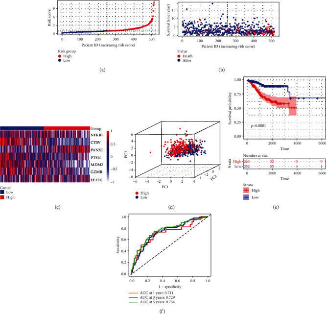
Figure 6.

Construction of the risk signature in the entire cohort. (a) Risk score map of patients in the high- and low-risk groups. (b) Survival status map of patients in the death (red spheres) and alive (blue spheres) groups. (c) Heatmap of gene expression in the high- and low-risk groups. (d) PCA plot showing different clustering between EC (red spheres) and normal endometrial tissues (blue spheres). (e) The Kaplan-Meier survival curves of patients in the high- and low-risk groups. (f) ROC curve evaluating the predictive performance of the risk signature.
