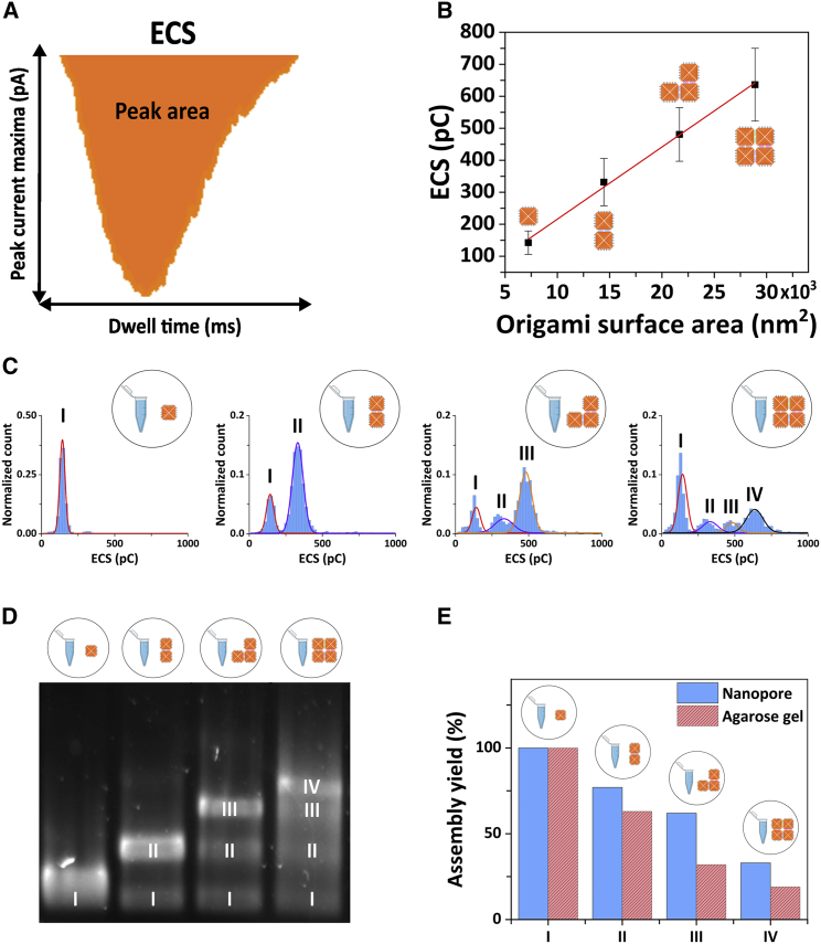
Figure 5.
(A) Schematic representation of the concept of equivalent charge surplus (ECS), which is obtained from calculating the area of the translocation peaks. (B) ECS as a function of the DNA origami surface area for the four DNA nanostructure assembled (the red line represents a linear fit to the data). The error bars represent the width of the Gaussian fits displayed in (C). (C) ECS histograms of the DNA origami samples; from left to right: monomer sample, dimer sample, trimer sample, and 2 × 2 sample. The distributions were fitted with single or multi-peak Gaussian distributions. The notation I-IV marks the peaks corresponding to each of the DNA nanostructures in the respective sample (e.g., the dimer sample shows two peaks in the ECS distribution, attributed to the presence of the monomer (I) and dimer DNA origami (II) in the sample). (D) Agarose electrophoresis gel of the DNA origami samples; from left to right: monomer samples, dimer sample, trimer sample, and 2 × 2 sample. The I-IV notation of the gel bands marks the presence of the nanostructure component in the respective sample, similar to the notation used for the ECS distribution in (C) of the figure. (E) Bar chart comparison of the assembly yield of each DNA nanostructure (blue bar: nanopore data, red bar: gel electrophoresis data). To see this figure in color, go online.

