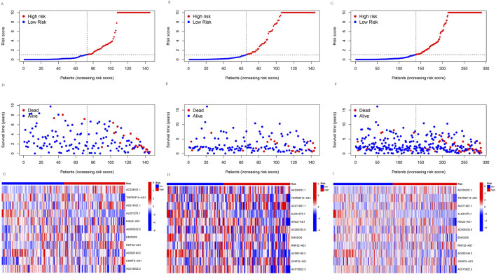
FIGURE 4.
Predicting the performance of signature. The risk curve is based on the risk score for each sample in the (A) training group, (B) testing group, and (C) all groups, where red and blue dots indicate high- and low-risk samples, respectively. The scatter plot is based on the survival status of each sample from (D) the training group, (E) the testing group, and (F) all groups, where red and blue dots indicate death and survival, respectively. The heatmap represented the signature of lncRNAs in the (G) training group, (H) testing group, and (I) all groups.

