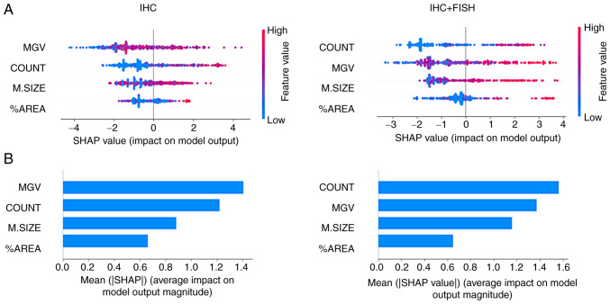
Figure 4.
Model classification differences explained by the SHAP values. (A) A plot was used to sort the features based on the sum of SHAP value magnitudes over all samples and show the distribution of the impact that each feature had on the model output. The color represents the feature value (red high, blue low) and the x-axis represents the impact score according to binary output (HER2- or +). (B) The mean absolute value of the SHAP values for each feature to get a standard bar plot showed the average impact on global model output. SHAP, Shapley Additive exPlanations.

