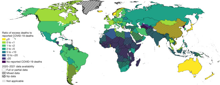
Fig. 6. Mapping the ratio of total excess deaths to total reported COVID-19 deaths.
The map shows the geographic distribution of the mean ratio of the total excess deaths to total reported COVID-19 deaths for years 2020 and 2021 across all 194 WHO member states. The darker the colour the higher the estimated mean ratio. The patterns indicate the quality of the all-cause mortality data that were available for each respective country with the solid pattern showing full or partial data, dots for mixed data and diagonal lines for no data.

