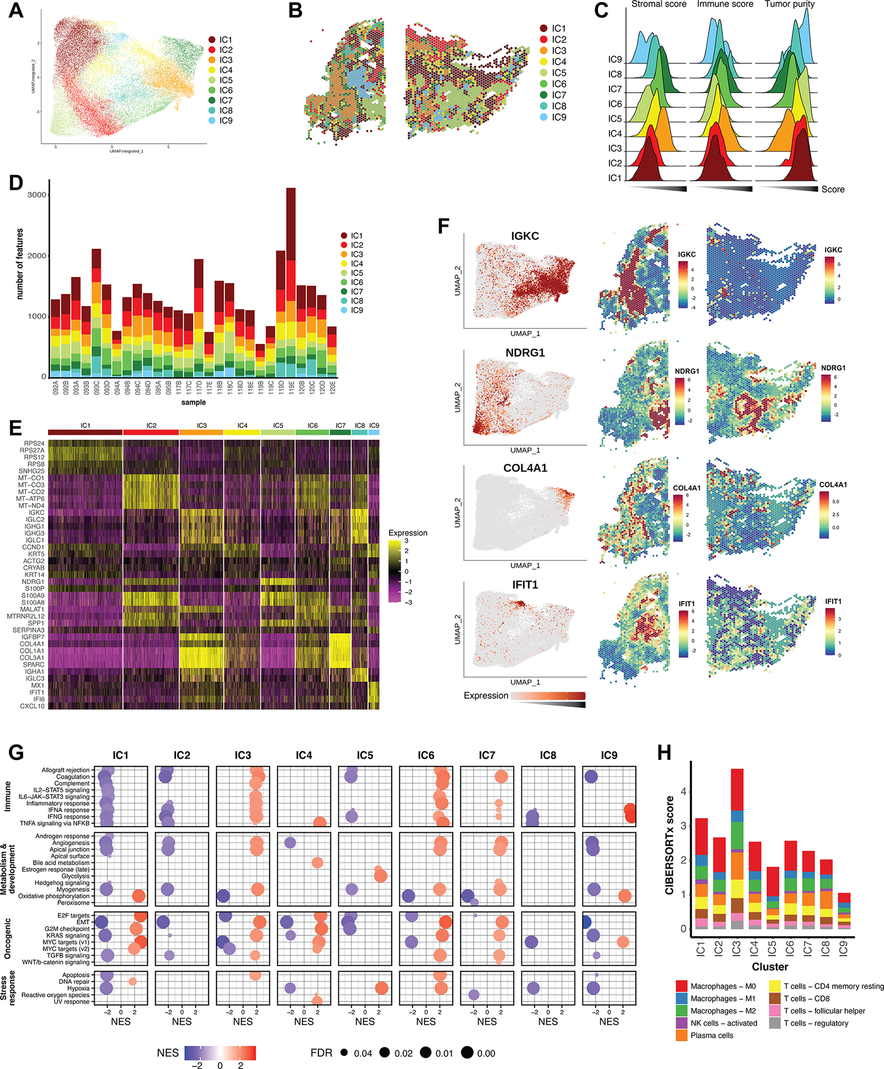
Figure 4. Clustering of an integrated dataset reveals shared cell populations.

A) Graph-based clustering analysis of the integrated reference dataset resulted in nine integrated clusters (ICs), depicted here on the integrated UMAP embeddings. (B) ICs mapped back to individual representative samples. (C) Ridgeline plot of ESTIMATE scores for all ICs, calculated for all corresponding features in the reference dataset. The x-axis represents score, and increases from left to right. (D) Bar graph representing the distribution of the nine ICs across the individual samples of the dataset. (E) Heatmap of top differentially expressed marker genes of the ICs across the integrated dataset. Color scale represents the Pearson residuals of normalized and variance-stabilized expression data (24). (F) Expression of selected marker genes represented on the integrated UMAP embedding, as well as spatially in individual samples. Color scales represent Pearson residuals. (G) GSEA of ICs using the Hallmark gene sets. Only results with a false discovery rate (FDR) < 0.05 are displayed. NES = Normalized enrichment score. (H) CIBERSORTx was used to deconvolute immune mixtures in each ICs. Absolute CIBERSORTx scores are represented on the y-axis, and immune identities of selected cell types are differentiated by color.
