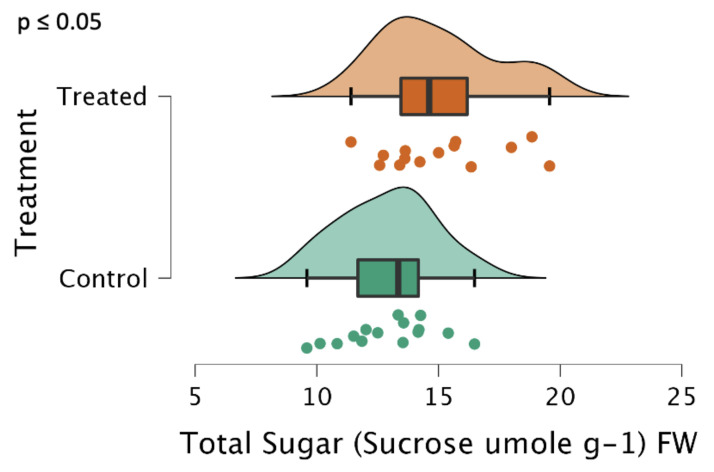
Figure 4.
Total sugars, reported in sucrose equivalents, represented as a raincloud plot [16]. The graph is comprised of a boxplot with the lines representing the median, lower, and upper-end measurements, as well as the lower and upper quartiles. Each dot represents the recorded value of the biological replicate, with the cloud representing the overall distribution of the data. Note that the differences were significant, p ≤ 0.05 (n = 15 plants, in triplicate, each for the treatment and control). Sugars were extracted from blended and lyophilized tuber tissues using ethanol and then determined spectrometrically with sulfuric acid and anthrone, using a calibration curve with sucrose.

