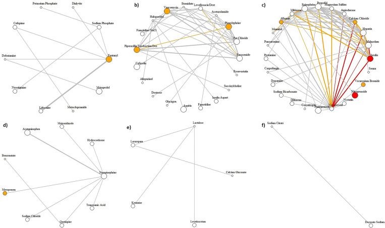
Fig 4. Hairball plots for medication clusters.
We identified six communities of medication clusters (from a to f), where each cluster is visualized as a hairball network diagram. The width of the edges represents the administration frequency (0 − 50; 50 − 500; >500). The color of the edges shows the strength of Pearson similarity coefficients for the medication pairs (correlation coefficients >0.08 is red, and 0.07−0.08 is orange). Stronger Pearson similarity coefficients indicate a more significant relationship between the prescription of isolated medications and AKI development. The size of the vertices represents the administration frequency of the single medications (0 − 20; 20 − 100; >100). The color of the vertices shows the strength of Pearson similarity coefficients for the isolated medications (correlation coefficient of >0.12 is red, 0.07− 0.12 is orange, and when there is no significant correlation, or medication was never administered alone, it is white).

