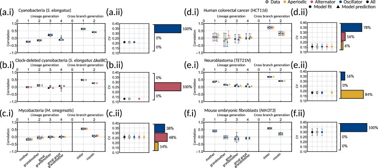
Appendix 1—figure 2. Bayesian inference demonstrates that multiple correlation patterns can explain the experimental data.
(a-f.i) Plots of model fits and predictions (solid markers) against the data (open markers) for the family pair correlation coefficients for (a) cyanobacteria, (b) clock-deleted cyanobacteria, (c) mycobacteria, (d) human colorectal cancer, (e) neuroblastoma and (f) mouse embryonic fibroblasts. Colours of the solid markers represent the fits and predictions for parameter samples clustered by correlation pattern. Inset for each panel is a bar chart giving the distribution of the three patterns for each dataset. (a-f.ii) Plots of model output against the data for the interdivision time covariance. In this figure, the error bars for the data (unfilled black points) are calculated via bootstrapping of 10,000 samples with replacement to give the 95% confidence interval. For the model, error bars represent the 95% credible interval, computed by taking the 2.5th and 97.5th percentile of the sampled values. For all plots, circles indicate fitted correlations and triangles show predicted correlations. We can see that the model fit is good for all datasets as the error bars overlap with that of the data, and this is reflected in the low AIC given in Appendix 1—table 1.

