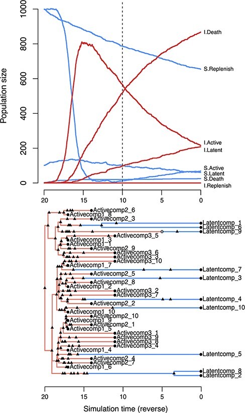
Figure 2.

Examples of twt simulation outputs for a model of cell dynamics in the latent reservoir. (top) Population dynamics simulated forward in time. Each line represents the population size of a different compartment. S = susceptible, I = infected. The dashed vertical line indicates the time of ART initiation. This plot was produced by calling the generic plot method on the S3 object from the twt function sim.outer.tree. (bottom) A tree simulated in reverse-time, relating 10 cells sampled from the latently infected compartment at τ = 0 and 30 from the actively infected compartment at  (Scenario 1), where
  . Triangles represent transmission events, open circles represent transitions, and closed circles represent sampling times. Branches representing cell lineages in a latent state (Latentcomp_N) are collapsed prior to simulating virus evolution. This tree visualization was generated from the same S3 object using the R package ggfree (https://github.com/ArtPoon/ggfree).
