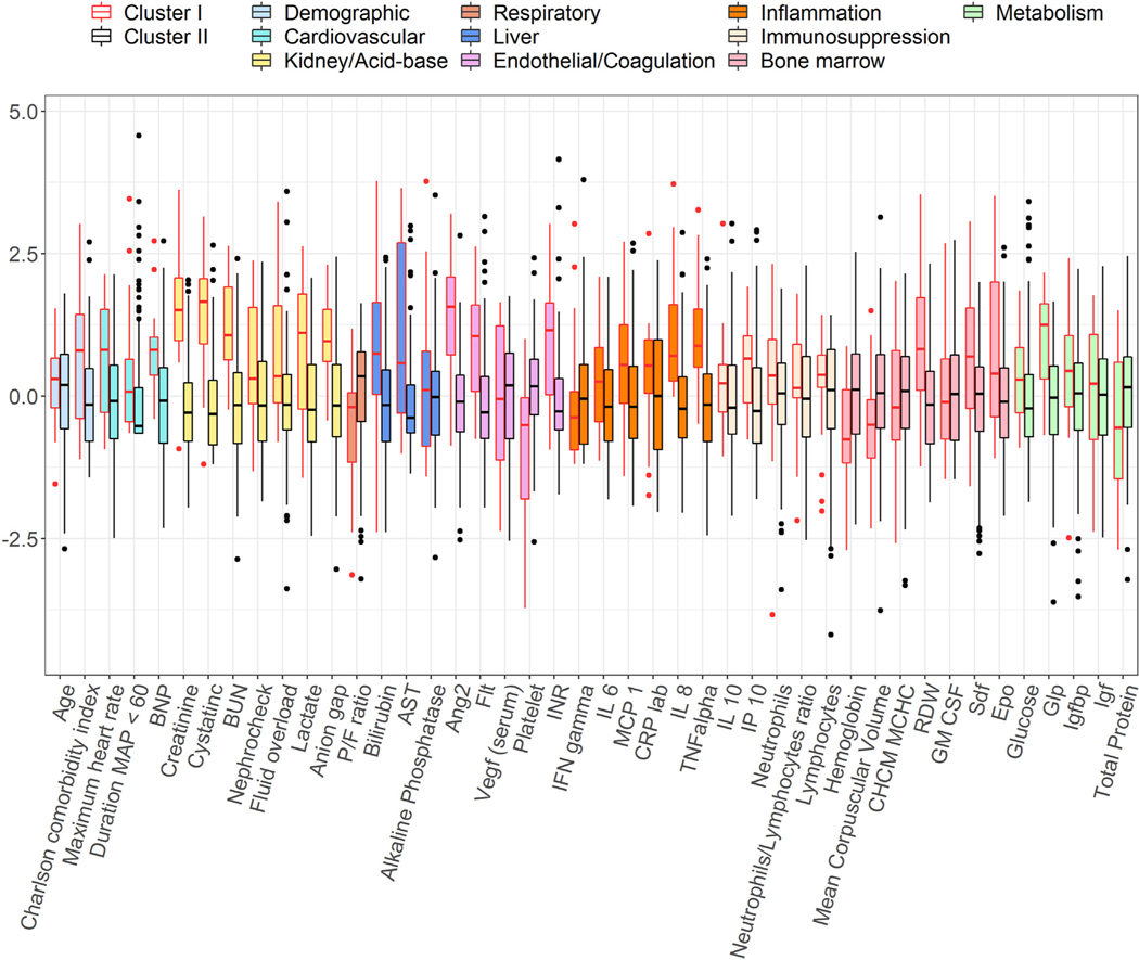
Fig. 3 –
Distributions of biomarkers by clusters. Side-by-side boxplots show the distributions of the standardized biomarker values across clusters. Each color represents a group of biomarkers based on their functionality. In each plot, the horizontal dash line represents the average value of the standardized biomarker in the whole cohort.

