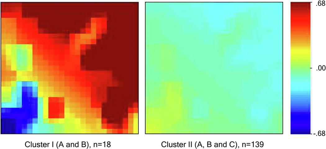
Fig. 4 –
Average biomarker mosaics for patients using a self-organizing map for each of the two main clusters. Average biomarker mosaics of a specific cluster illustrate the average value of biomarker values for patients within that cluster. Red color correlates with increased biomarker expression, and blue color correlates with decreased biomarker expression compared to mean values for the development cohort, which is illustrated by the green color.

