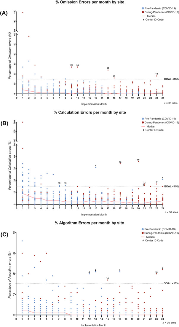
FIGURE 3.

The quality of PEWS use over time. These graphs describe the results of monthly monitoring of three types of PEWS errors used to assess the quality of PEWS use at all centers: (A) omissions (documented vital signs without using PEWS), (B) PEWS score calculation errors, and (C) PEWS algorithm nonadherence (not following the PEWS algorithm correctly for high scores). At each center, data for PEWS errors were collected from the start of the PEWS pilot through October 2021 (or until 18 months after implementation). PEWS errors were calculated two or three times each week through a review of nursing vital signs and PEWS documentation for all hospitalized patients by the local PEWS implementation leaders and were aggregated monthly. In each graph, the x‐axis is the implementation month or the month since the start of the PEWS pilot at each center, and the y‐axis is the percentage errors measured that month. Dots represent data for each of 36 Proyecto EVAT centers; blue dots indicate the months before the COVID‐19 pandemic (before March 2020), and red dots indicate the months after the start of the COVID‐19 pandemic (after March 2020). The solid red line represents the median percentage of errors across the 36 centers during each implementation month. The black dotted line represents the goal threshold (GOAL) used to define high‐quality PEWS use (<15% errors in each error type). Centers with monthly error results above this threshold (>15% errors) more than 6 months after the start of the PEWS pilot are marked with their center number (Center ID Code). COVID‐19 indicates coronavirus disease 2019; PEWS, pediatric warning systems; Proyecto EVAT, the Early Warning Assessment Scale Project.
