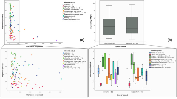
FIGURE 3.

Scatterplots and box plots showing relation between diagnostic yield and cohort characteristics. (a) Scatterplots showing relationship between diagnostic yield and number of cases sequenced within a specific study. Legend describes number of studies for which data on this cohort characteristic was available. Colors indicate disease group from which studies were derived. Each dot represents for one study what the number of sequenced cases was in that cohort and what diagnostic yield was obtained from that same study. (b) Boxplots representing the diagnostic yield in clinical cohorts versus research cohorts. Lower half shows clinical versus research cohorts across the different disease groups. Legend describes number of studies for which data on this cohort characteristic was available.
