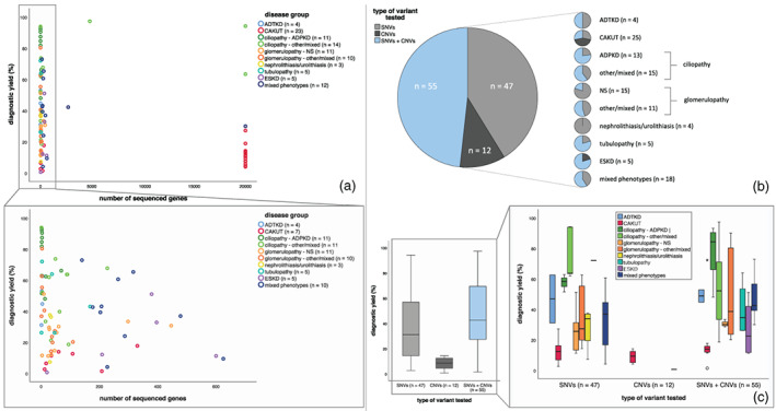
FIGURE 4.

Scatterplots and box plots showing relation between diagnostic yield and test characteristics. (a) Scatterplots showing relationship between diagnostic yield and number of genes sequenced within a specific study. Legend describes number of studies for which data on this specific test characteristic was available. Not all studies were included since in some studies the number of genes sequenced differed within the study. Colors indicate disease group from which study was derived. Each dot represents for one study what the number of sequenced cases was in that cohort and what diagnostic yield was obtained from that same study. (b) Pie charts visualizing number of studies that performed either single nucleotide variant (SNV) or copy number variation (CNV) testing or both. (c) Boxplots representing the diagnostic yield in relation to type of variants that were tested. In the right panel, this is split in the different disease groups.
