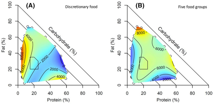
FIGURE 4.

Surface plots showing the relationship between daily dietary macronutrients and total daily energy (kJ) from (A) discretionary foods and (B) five food group foods plotted on percentage energy from macronutrients (lower intake represented with cooler colors, i.e., blue, and higher intake represented with warmer colors, i.e., red). Polygon area: Acceptable Macronutrient Distribution Range (AMDR) for Australians and New Zealanders [Color figure can be viewed at wileyonlinelibrary.com]
