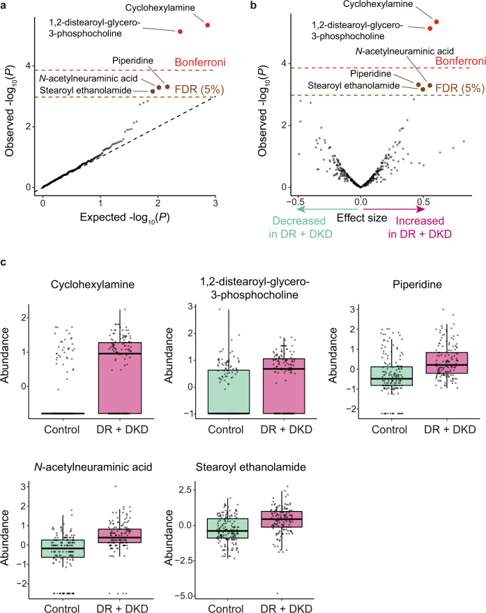
Fig. 1. Results of the case–control association tests for metabolites.
a A quantile–quantile plot of the p values in the logistic regression analysis. The x-axis indicates log-transformed expected p values. The y-axis indicates log-transformed observed p values. The diagonal dashed line represents y = x, which corresponds to the null hypothesis. The horizontal red line indicates the Bonferroni-corrected threshold (α = 0.05), and the brown line indicates the FDR threshold (FDR = 0.05) calculated by the Benjamini-Hochberg procedure. Metabolites with p values less than the Bonferroni thresholds are plotted as red dots, metabolites with p values less than the FDR thresholds are plotted as brown dots, and other metabolites are plotted as black dots. b A volcano plot. The x-axis indicates effect sizes in logistic regression. The y-axis, horizontal lines, and dot colors are the same as in a. c Boxplots for the five metabolites which were significantly associated with the complications of T2D. Boxplots indicate the median values (center lines) and IQR (box edges), with the whiskers extending to the most extreme points within the range between (lower quantile − [1.5 × IQR]) and (upper quantile + [1.5 × IQR]). The number of samples used for the analysis is NDR + DKD = 141 and Ncontrol = 159. DKD, diabetic kidney disease; DR diabetic retinopathy; FDR, false discovery ratio; IQR, interquartile ranges; T2D, type 2 diabetes.

