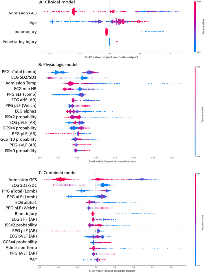
Figure 5.
For the clinical (A), physiologic (B), and combined (C) neurologic decline (ND) prediction models, each contributing feature is displayed on the y axis. The x axis shows each feature’s Shapley Additive Explanations (SHAP) values. A larger SHAP value denotes a higher log odds ratio that a variable’s value added to the prediction. Values are represented in color ranging from red to blue (high to low). The y axis from top to bottom ranks the variables’ importance, which is the mean of their absolute SHAP values.

