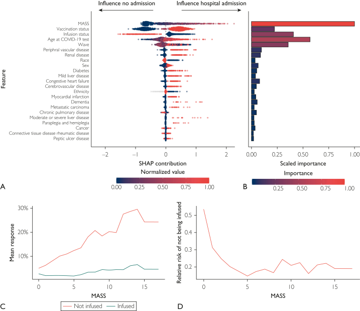
Figure 3.
Shapley Additive Explanation (SHAP) plot, variable importance plot, partial dependence plots, and relative risk of admission based on a gradient boosting machine model. (A) SHAP contribution is displayed in overall rank order, with the variables most influential in predicting 28-day hospital admission at the top of the plot. Each dot represents a single patient, with large SHAP values indicating influence toward hospital admission (positive values) or no hospital admission (negative values). Large absolute SHAP values indicate that a patient’s overall prediction was highly influenced by that variable’s value. Color represents the normalized values for each variable, with high values in red and low values in dark blue. (B) A variable importance plot ordered on the basis of SHAP feature importance. Bar width and color specify scaled importance (ie, selection order in the boosted trees and relative changes in split purity in the tree). (C) In the top row, partial dependence plots show the relationship between Monoclonal Antibody Screening Score (MASS), monoclonal antibody treatment, and 28-day hospital admission stratified by wave after accounting for all other variables in the model. The mean predicted probability of hospital admission was lower across all MASS values and waves for patients treated with monoclonal antibody therapy (blue line) compared with those who were not (red line). (D) The relative risk of hospital admission in patients who did not receive monoclonal antibody therapy derived from the partial dependence estimates. COVID-19, coronavirus disease 2019.

