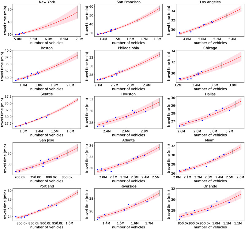
Fig 2. Bayes fit for 15 metro areas.
The blue points are the observed data. The solid red line is the mean prediction, with shaded area covering ± one standard deviation of the prediction. Also shown are grey bars denoting the prediction intervals under a 25% (leftmost bar) and 50% (rightmost bar) transit and carpool mode shift to single occupancy vehicles. See also S1–S4 Figs for all 74 modeled metro areas.

