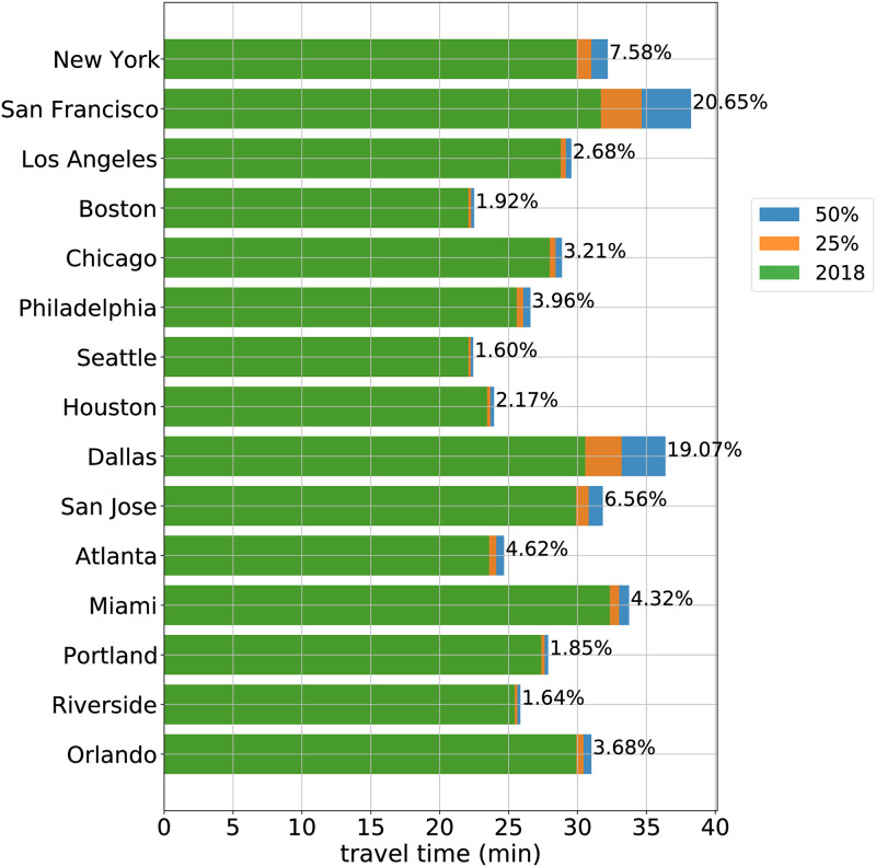
Fig 3. Travel time increase predictions for top 15 metro areas in predicted cost.
The 2018 one-way travel time is shown in green. Also shown is the additional travel time under 25% (orange) and 50% shift (blue) from transit and carpool to SOV. The percentage increase of commute time from 2018 under a 50% shift appears to the right of each bar.

