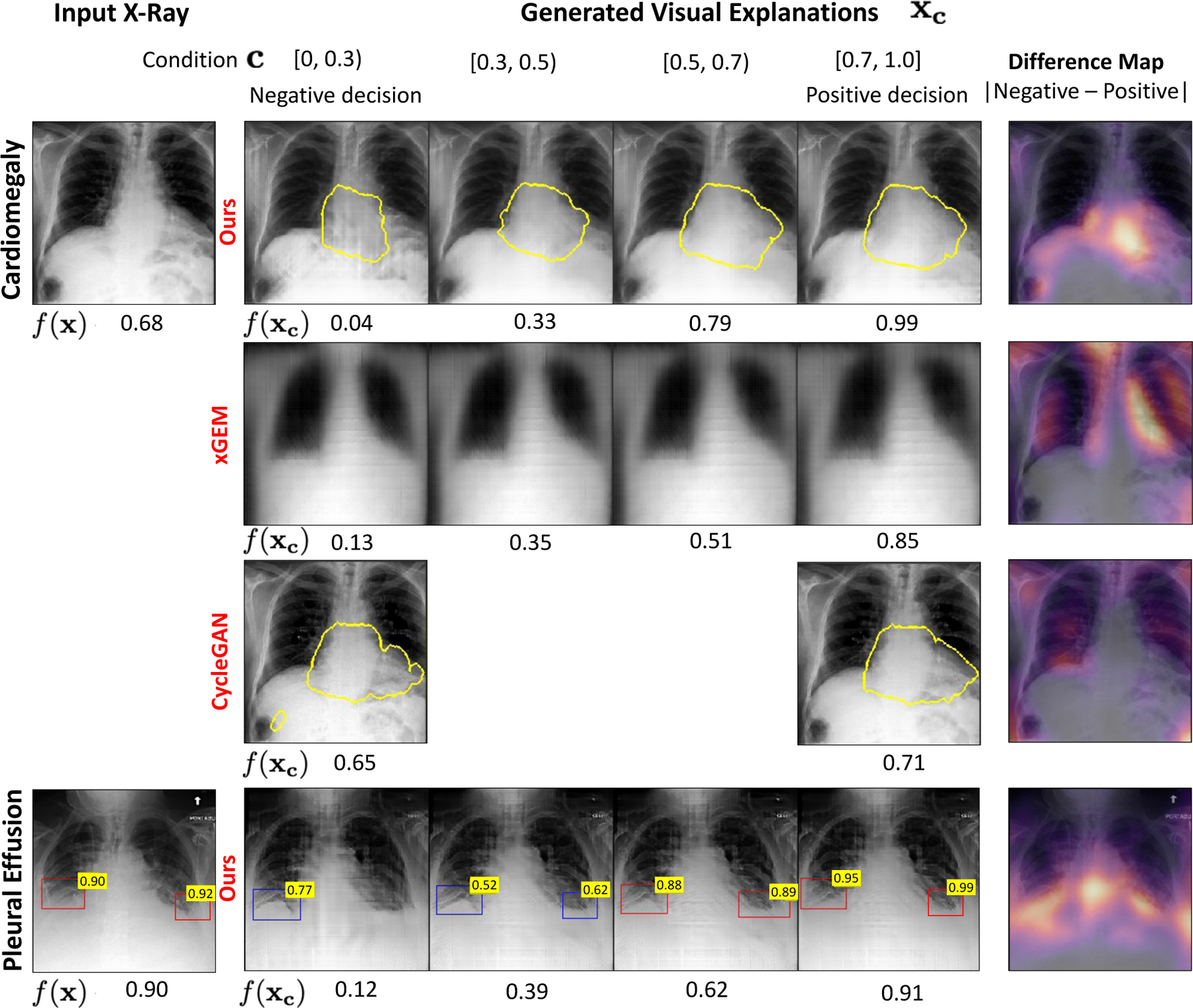
Fig. 4.

Qualitative comparison of the counterfactual explanations generated for two classification tasks, cardiomegaly (first row) and pleural effusion (PE) (last row). The bottom labels are the classifier’s predictions for the specific task. For the input image in first column, our model generates a series of images xc as explanations by gradually changing c in range [0, 1]. The last column presented a pixel-wise difference map between the explanations at the two extreme ends i.e., with condition c = 0 (negative decision) and with condition c = 1 (positive decision). The heatmap highlights the regions that changed the most during the transformation. For cardiomegaly, we show the heart border in yellow. For PE, we showed the results of an object detector as a bounding-box (BB) over the healthy (blue) and blunt (red) CP recess regions. The number on the top-right of the blue-BB is the Score for detecting a healthy CP recess (SCP). The number on red-BB is 1-SCP.
