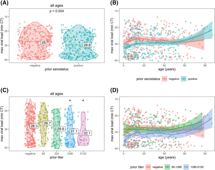
FIGURE 4.

SARS‐CoV‐2 viral load by prior immunity and age. Prior immunity was measured as serostatus (A and B) and anti‐spike titer (C and D). Each data point represents an infection. Violin plots (A and C) show the distribution of viral load, by each level of immunity; horizontal lines indicate median CT values and printed numbers represent mean CT values. Asterisks in (C) indicate mean CT values significantly different from those in the negative group (p < 0.05). Line plots (B and D) are fitted with a loess smoother and shaded regions represent 95% confidence intervals.
