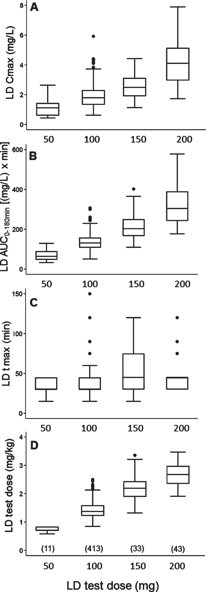
Fig. 1.
Box plots of levodopa: A) peak plasma concentration; B) area under the 3-hour plasma concentration-time curve; C) time to peak plasma concentration; D) test dose, in milligram per kilogram, by different test doses, in milligram. Box plots depict the range between the 25th and 75th percentiles of the data. The horizontal line marks the median value; capped bars indicate 10th–90th percentiles. Black circles represent outlying values. The number of patients for each test dose is reported in brackets.

