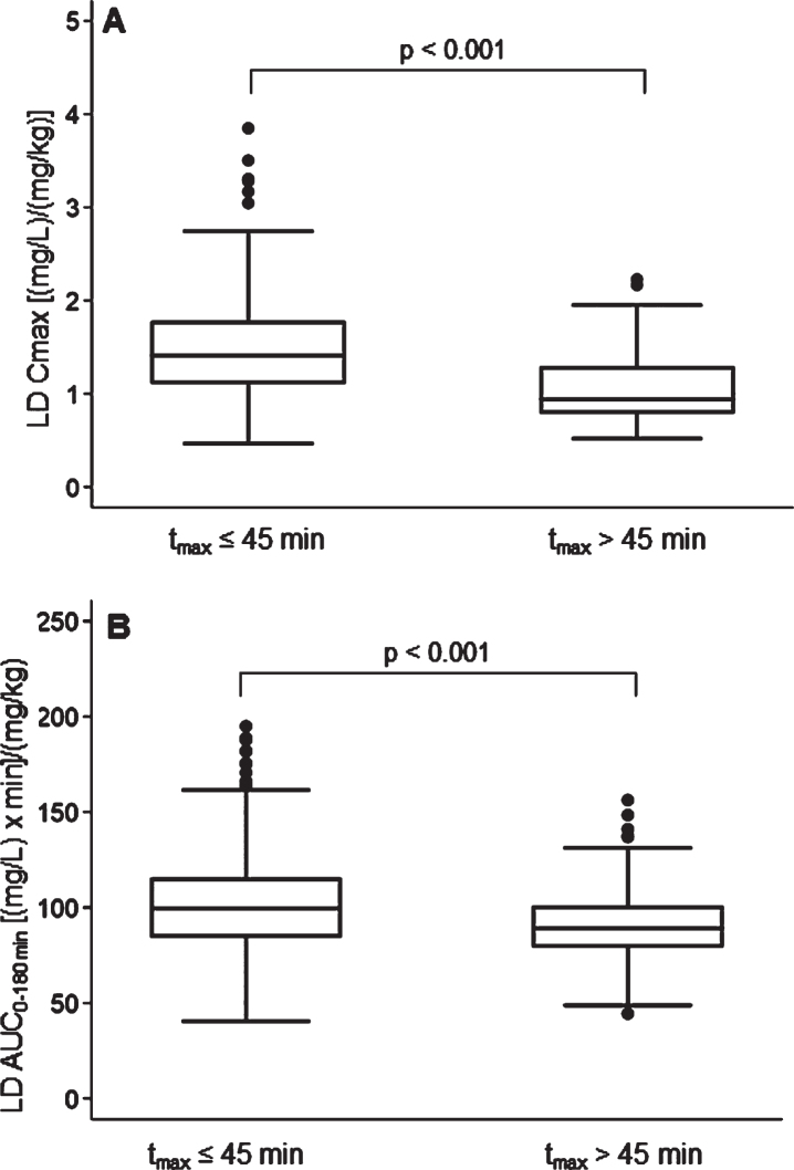
Fig. 4.
Box plots of levodopa: A) peak plasma concentration; B) area under the 3-h plasma concentration-time curve, both normalized for weight-adjusted test dose by time to peak plasma concentration. Box plots depict the range between the 25th and 75th percentiles of the data. The horizontal line marks the median value; capped bars indicate 10th–90th percentiles. Black circles represent outlying values. p, significance of comparison by Mann-Whitney U test.

