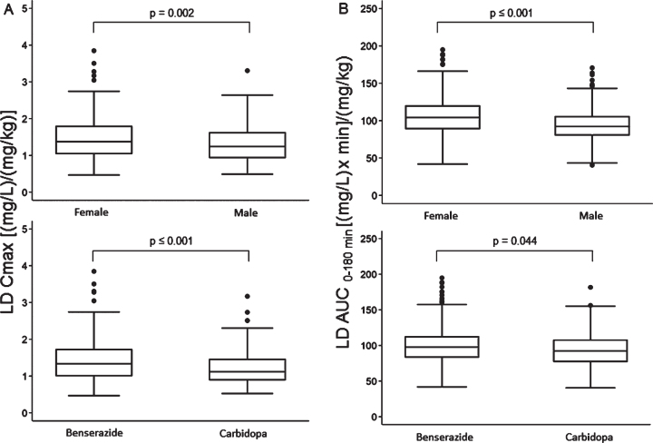
Fig. 5.
Box plots of levodopa: A) peak plasma concentration; B) area under the 3-h plasma concentration-time curve, both normalized for weight-adjusted test dose by sex (upper section) and dopa decarboxylase inhibitor (lower section). Box plots depict the range between the 25th and 75th percentiles of the data. The horizontal line marks the median value; capped bars indicate 10th–90th percentiles. Black circles represent outlying values. p, significance of comparison by Mann-Whitney U test.

