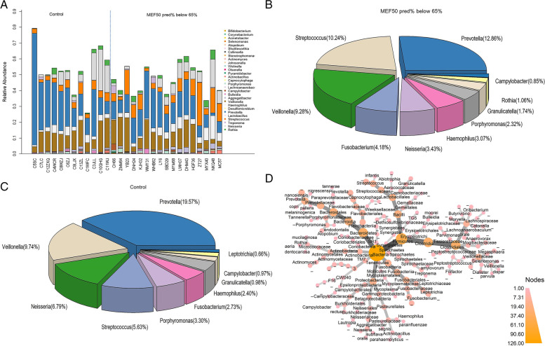
Fig. 1.
The sputum microbiome at the genus level. A Bar plot of all the samples, each bar shows the relative abundance of one individual B) Pie chart of the microbiome composition at genus level in MEF50pred%-low group. C Pie chart of the microbiome composition at genus level in healthy individuals. D Phylogenetic map of the median relative abundance differences in bacterial taxa between the healthy control group and the MEF50pred%-low group, the ending circle of each branch represented for species (n = 29). The depth of color of the nodes corresponds to the degree of difference in median relative abundance of the bacterial taxa. The darker the color of the phylogenetic branches, the higher median differences, whereas gray nodes and branches indicate no significant differences

