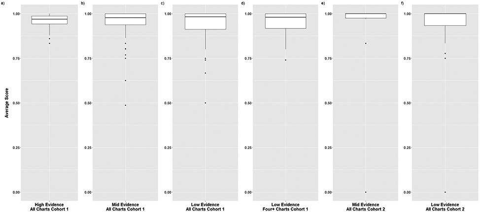
Figure 3. Boxplots of Average Scores for Charts in Cohorts 1 and 2.

The distribution of average scores for each chart is displayed for Cohort 1 (all charts in high, mid, and low evidence categories and four or more charts in the low evidence category) and Cohort 2 (all charts in the mid and low evidence categories). The solid line depicts the median value and the rectangle depicts the interquartile range (IQR; lower and upper quartile of data). The lines extending from the boxplot show the quartiles +/− (1.5)(IQR) and the dots show potential outliers.
